
How to Create a 10X User Experience on Your Website that Drives More Sales
According to an Econsultancy report, “only 55% of companies are currently conducting any online user experience testing.”
Well, that’s disappointing.
Because “every $1 invested in UX can have a return of up to $100 for your business.” It’s crucial that your team focus on creating the best experience for your customers.
Consumers desire an easy-to-use site that is appealing to the eyes and offers original content. Moreover, your website should be optimized to support multiple screens.
Jesse James Garrett (@jjg), co-founder of Adaptive Path, states:
“What makes people passionate, pure and simple, is great experiences. If they have great experience with your product and they have great experiences with your service, they’re going to be passionate about your brand, they’re going to be committed to it. That’s how you build that kind of commitment.”
If your SaaS is seeking to drive mores sales, start by transforming your website into an experience. We’ll explore how to do just that. So, keep reading.
Copy
You want more sales. For that to happen, your team must convert more visitors into customers.
Poor copy is one of the primary barriers of an effective user experience. Most brands don’t speak the customer’s language. There product information lacks detail and turns people away. Let the following techniques change the way you approach copywriting.
1. Capture Attention
If no one is paying attention to what you have to offer, all your efforts will be meaningless.
People are busy, and they desire digestible information. Your team has less than 10 seconds to capture your audience’s attention.
Hassan Ud-deen (@Hassassinzcreed) recommends making the first sentence hypnotic:
“Your first sentence has to open with a bang. It has to immediately snag your audience’s attention and drag them into your copy. If your readers don’t make it past the first few sentences, they sure as hell ain’t making it to your call to action.”
So, make a good first impression. Tell first-time visitors who you are and what you do in a few simple words. If they are interested in more, create linked pages (‘about us’ or ‘our services’) available as linked pages in your header.
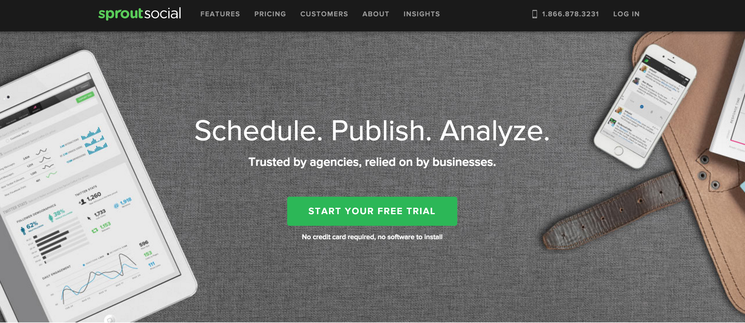
Here’s an example from SproutSocial:
With only three words, we know that this social media management tool schedules, publishes, and analyzes our content.
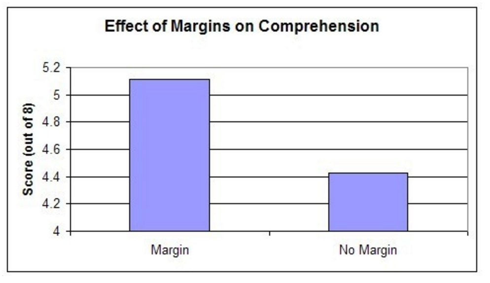
Also, be mindful of sufficient spacing between characters, words, lines, and paragraphs. A research study “discovered that manipulating the amount of margins of a passage affected reading comprehension and speed.”
Give your visitor a reason to learn more about your company. And do it quickly!
2. Solve Pain Points
If you don’t know what keeps your customers up at night, you’re missing an opportunity to solve their problems.
Traditionally, people buy products and services to fill a void missing in their lives. That includes the teenager looking for the latest pair of jeans or a salesperson interested in the best CRM solution.
Ramin Assemi (@Ramin), a marketer at Close.io, states, “Capturing your audience’s attention is a matter of writing about the topics they’re searching for. Solve their pain points and answer their questions. Attract them with relevance, keep them coming back with trust.”
To uncover pain points, start with your existing customers. Inquire about their biggest struggles with one-on-one interviews or a basic survey.
Another technique is to monitor your competitor. Find out which customer challenges they focus on. You can sift through their site or even sign up for their newsletter.
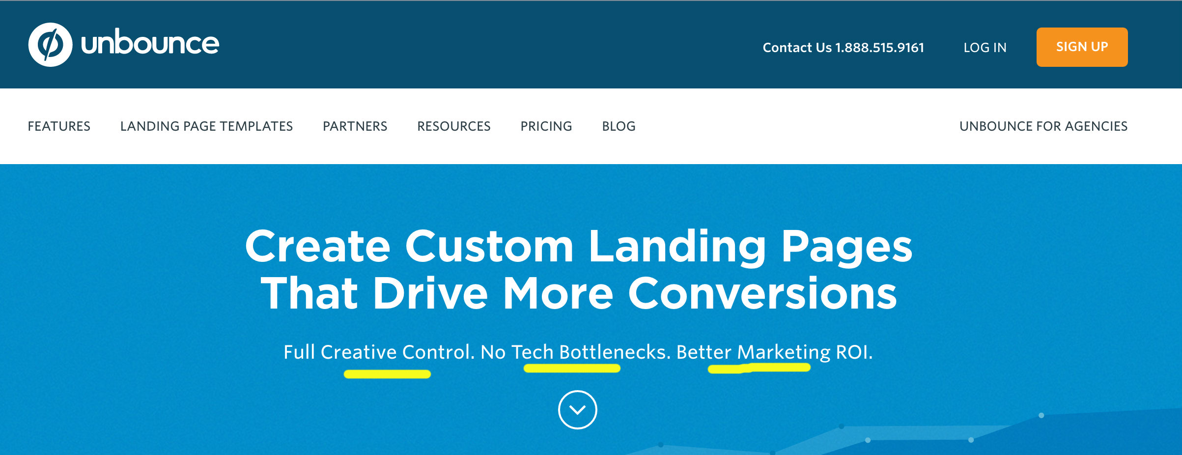
Unbounce does an effective job at highlighting their visitors’ pain points. They understand that most of their potential buyers have landing page concerns around control, tech issues, and revenue increases.
3. Take Action
Honestly, you don’t want visitors to come to your site and just read more about your business. You want consumers to actually take action.
You want people to sign up for your email list or download your new ebook. Hell, you want them to purchase your services!
Action verbs are what you need.
Rob Wormley (@RobWormley), co-author of 100 Days of Growth, states, “A subtle way to get your reader to take action is to use action words in your copy. Words like ‘get’, for example. Be sure to avoid passive voice in your copy if you want your reader to do something.”
Check out this small list of action verbs:
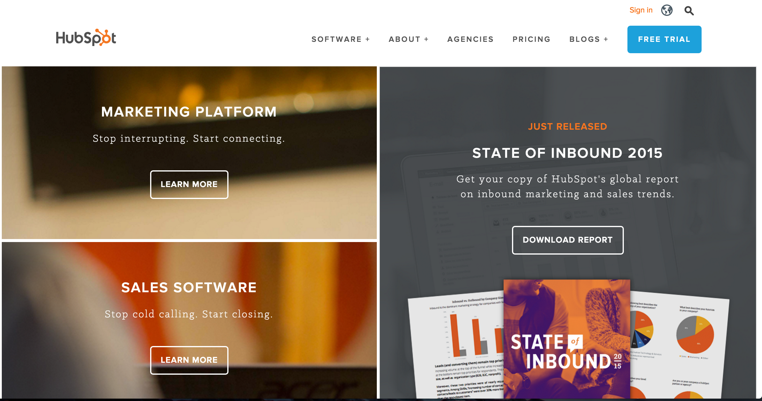
Here’s some action-oriented copy from our friends at HubSpot. This company believes you should stop doing things the old way and start achieving results.
4. Talk the Talk
Copy conveys meaning.
In order to keep your audience interested, you must speak their language. It all starts with choosing the right words. In other words, skip the jargon and stick to the terms that will resonate with buyers.
So, how do you accomplish that?
One way is to use platforms like Keyword Tool to discover which keywords people are searching for in Google, Bing, YouTube, and Amazon. Then, it’s up to your team to decipher how customers use those keywords and the best way to integrate those phrases into your copy.
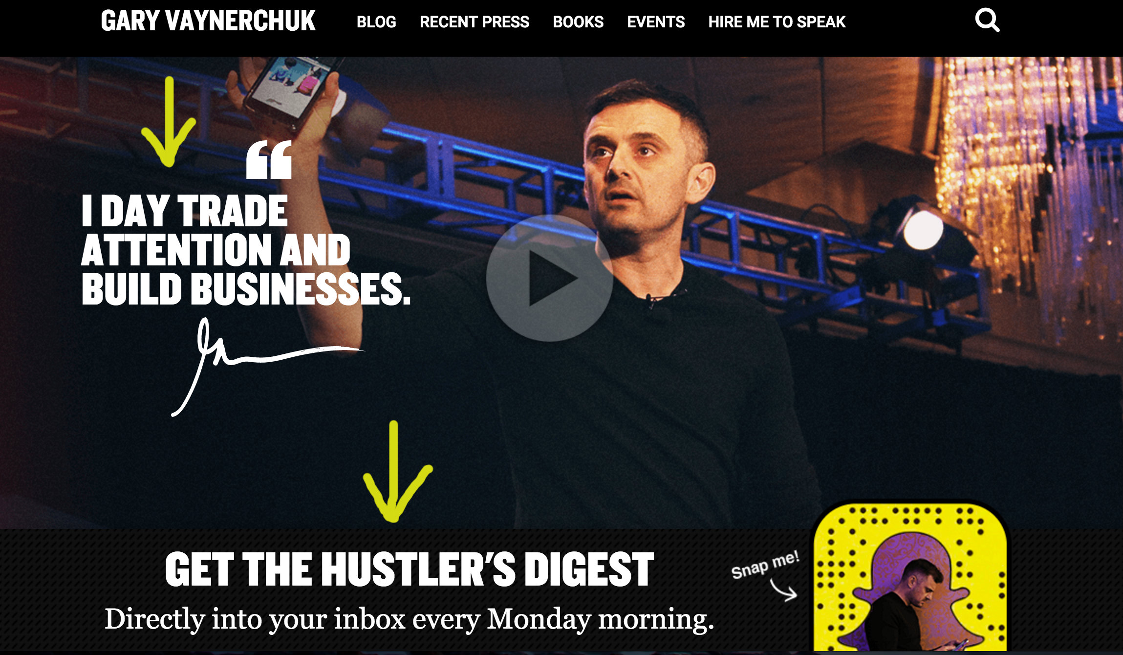
Gary Vaynerchuk, entrepreneur, investor, and host of the #AskGaryVee Show, knows his audience is hungry for knowledge to build their businesses. Plus, he understands their desire to be real hustlers in their own industries.
Live Chat
Live chat lets visitors talk to real people as they browse your site. It’s similar to a personal assistant. They can ask chat agents about specific items, discounts, and the checkout process.
Moreover, it gives your team the opportunity to circumvent any mishaps in the user experience.
With people wanting everything right now, live chat is an instant solution to address any problems your customers may have.
1. Be Human
People buy products from people, not businesses. We want real interaction that will help us solve problems and get the services we need.
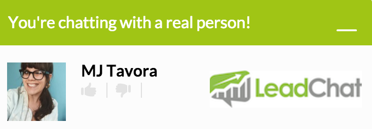
Give your brand a face, literally. Your live chat app should include a name and a photo of the chat agent.
This humanizes the experience and customers will feel more comfortable talking with your reps. To increase conversions, use photos with friendly faces.
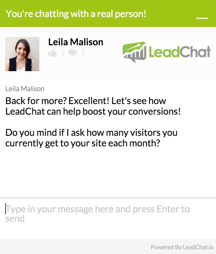
This is how we do it at LeadChat:
Live chat is also great for establishing relationships with your visitors. Your team can gain deeper insights on their likes and dislikes.
It’s similar to shopping with a trusted friend or personal assistant. Strive to learn, not just sell.
Brian Honigman (@BrianHonigman ), CEO of Honigman Media, writes:
“The main reason above all, is that live chat offers convenience for customers right from your website without them having to leave looking for assistance on the phone, email or social media. Added convenience is what helps build strong relationships with your customers since the availability of help and the speed at which this help is delivered is often the two most cited reasons people say they had an enjoyable experience with a company.”
2. Availability
The main purpose for offering live chat is to be accessible to your customers when they’re browsing your site. You want to give immediate help when a problem or a question arises.
In order to do that, you must guarantee to be available to your customers. And I mean fully available, not just two hours out of the day.
Set a schedule. If your agents will be online from 9am-5pm, make that clear to your customers. If you’re going to operate 24/7, then abide by that standard.
Source
You don’t want visitors feeling like a creep for wanting to speak to a live chat agent. So, don’t falter from your schedule. If you do, you’re essentially breaking a promise and consumers will see it as unprofessional.
Amanda Stillwagon (@SMBMarketingWiz), Chief Marketer for Small Business Trends, says the following:
“If customers know there will always be a representative available to answer questions, they will likely have fewer concerns doing business with you again. And an improved experience through live chat also increases the odds that they will tell others about your company or offerings.”
3. Ask Questions
Think about live chat agents as online sales clerks. In real life, associates would chat with the customer, ask questions, and provide meaningful suggestions. This same rule applies for live chat sessions.
Our brand likes to ask questions in order to provide businesses with a customized experience. Then, our reps can direct them to the right product that fits their needs.
Live chat is even better because agent can be trained to handle multiple conversations at once. It’s all about equipping your team with the tools to be efficient.
Give them canned responses that can easily be customized. Encourage proper language with accurate spelling and no grammatical errors.
Also, remind staff to include the brand’s personality. For example, a tattoo studio may use informal language because it’s part of the brand’s image. And customers will expect it.
4. Visibility
Can visitors find your live chat feature? Consumers shouldn’t be searching to speak to someone.
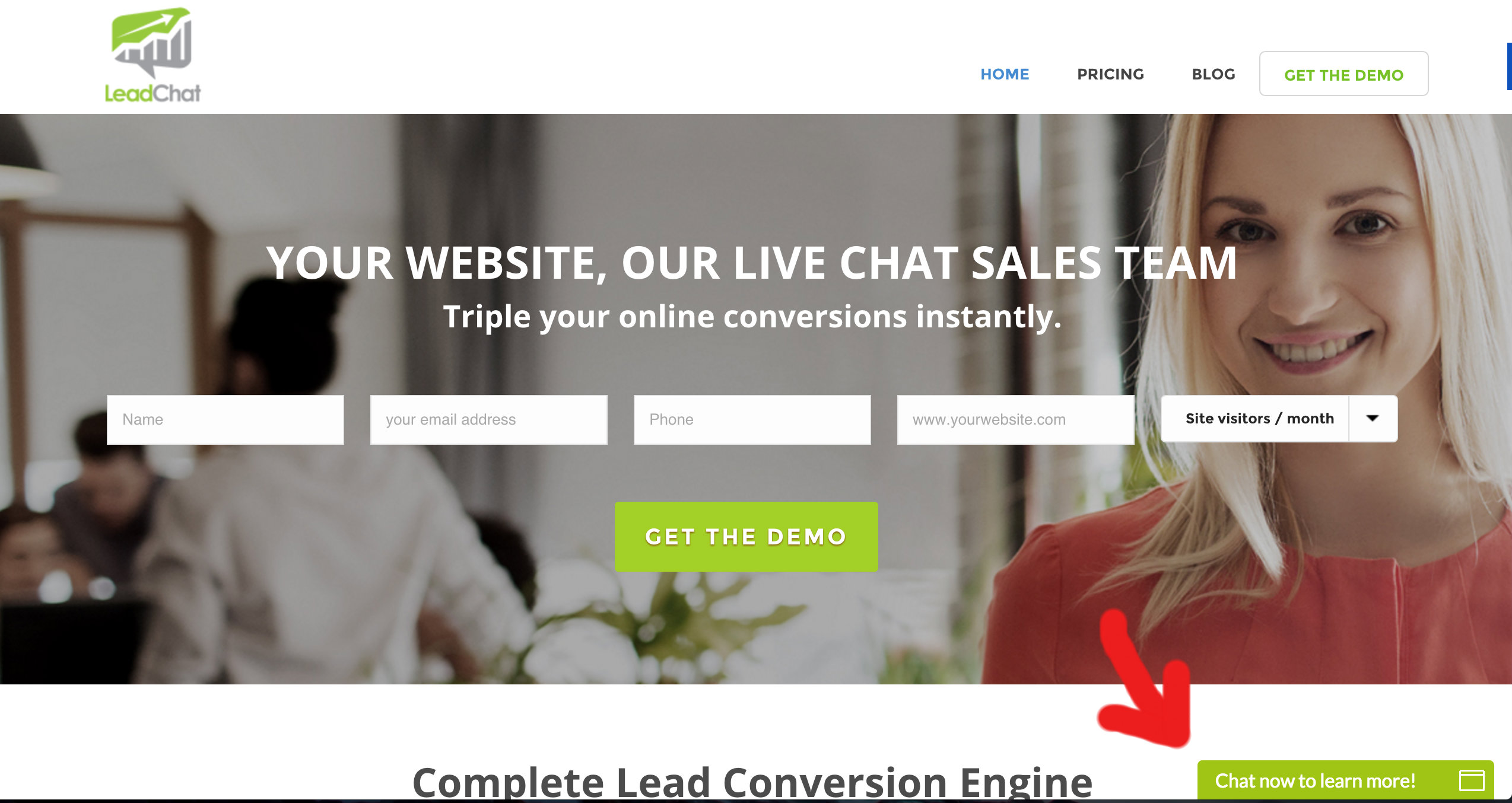
Online help greatly impacts the customer experience. So, place your live chat in an obvious location. It should fit the overall website design but also stand out.
Avoid having the chat button floating on the page. It’s a distraction to the shopper. Instead, pin the chat button at the right corner of your page.
Don’t play hide-and-seek with your live chat platform. Make it convenient for the visitor.
Images
Colors can determine whether your website has visual appeal or not. Different color combinations will attract different audiences.
For example, a survey “revealed that blue was the favorite color among women, whereas the color orange was voted as their least favorite.”
Perform tests to find out which color choices will optimize your conversions.
Give your customers visual cues to show them which content is important. Create calls-to-action based on the psychology of color.

“Different colors evoke different messages. Think about the message that you want to evoke for a user (trust, experience, intelligence) and choose your colors wisely,” says Darling Jimenez (@ddj2107), web developer and inbound marketer.
1. Add Headlines to Featured Images
Your featured image is your main attraction. It’s the visual that captivates your audience.
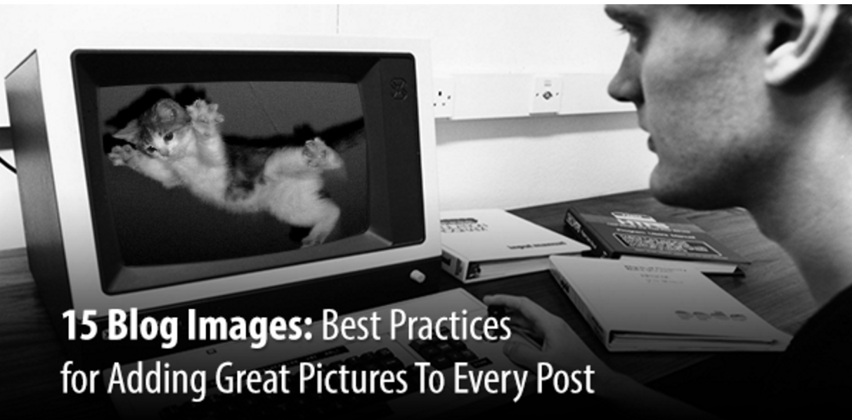
People will see it on your blog posts and on social media. So, make it count. Place your headline in the image.
Andy Crestodina (@crestodina) recommends using Canva. This tool makes it easy to add text to pictures. Therefore, people who just see your image will know exactly what your blog post discusses without having to scroll down.
Learn from this feature image on Orbit Media’s site:
2. Eye Direction
Incorporate images that will guide readers to your content.
James Breeze, a usability specialist, performed “an eye-tracking study that suggests that a photo’s subject can guide the user’s eye fixations on the web page.”
When visitors arrive to your site, they normally fixate on the eyes of the subject on the screen. So, if the subject is faced forward toward your viewer, that viewer will rarely pay attention to the content.
However, when the subject faces the product or text, the visitor’s eyes will follow that direction:
3. Ditch Low Quality Images
Avoid making small or blurry images work because you like them. They won’t.
Give your shoppers the best visual experience possible. Your images should be crisp. If the text is on the image, make sure the words are clear, too.
Consumers shouldn’t be squinting their eyes. When this occurs, they get frustrated and will leave your website.
Look at the two images below. Which one has the best quality?
The image to the right offers your visitors the best quality.
4. Infographics
Research shows that “60% of marketers predict the use of infographics will increase in 2016 compared to 2015.” And rightfully so!
Infographics intertwine graphics with data. Their purpose is to make complex information easy to understand through visual representations. It’s useful to show website visitors how your product works or what problem your services solve.
Neil Patel (@neilpatel), co-founder of Kissmetrics and CrazyEgg, suggests focusing on the flow:
“The greatest strength of an infographic is that it can flow both cognitively and visually. An infographic is like a good story. It has the ability to convey an idea by taking you from one phase to another, sequentially and seamlessly. The dots are all connected, and the ideas integrated.”
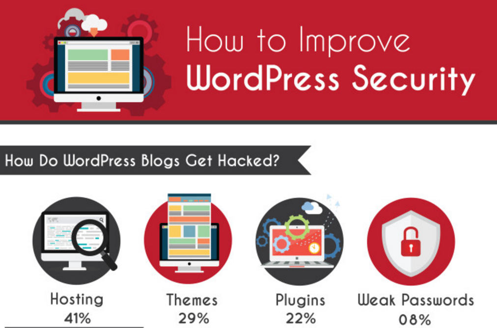
Below is a snippet of an infographic showing consumers how WordPress blogs get hacked.
 Source
User-Generated Content
Consumers stay away from sales pitches. Instead, they would rather have conversations. And those discussions begin with your customers.
Shoppers want to hear about your products from fellow shoppers. They desire information from people with direct experience.
This new cultural shift takes brands out of “sales mode.” It’s called user-generated content.
Now, companies must encourage their loyal consumers to share their thoughts. Plus, it pushes brands to develop creative ways to showcase UGC to their advantage.
1. Product Descriptions
Research found that “UGC is 20% more influential than any other type of media.” Build shopper’s trust by showing off your current customers. It will validate your brand and entice more people to purchase your products.
Increase your conversions by coupling UGC with product descriptions. It’s instant social proof and will influence the buyer’s purchasing decision.
Aimee Millwood (@aimeemillwood), Blog Manager at Yotpo, agrees:
“User-generated photos perform better on social than branded pictures because they blend in with other pictures. Rather than standing out as a promotional material, product photos taken by customers look like every other update that customers are scanning through.”
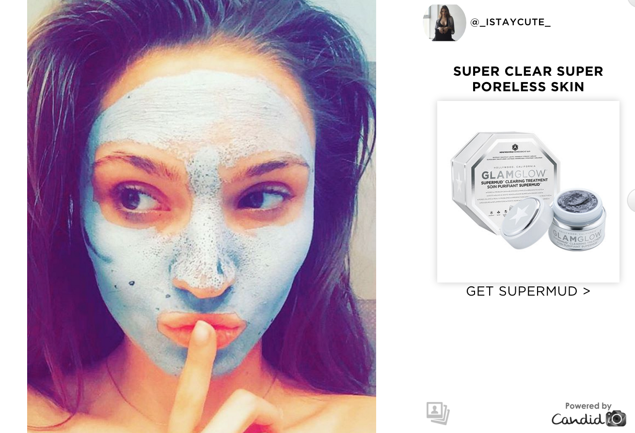
Here’s an example from GlamGlow. A customer’s beauty product photo is paired with a call-to-action to purchase.
2. Testimonials
Spotlight the results you obtain for your customers. Let visitors know that your current clients value your services.
Testimonials are one the best forms of social proof. But it’s how you present those results that matter.
For instance, each quote should be carefully crafted by your customer to highlight what you did for them and what the result was. A simple phrase like, “X company is great” won’t impress anyone.
Also, include a picture and link with the quote. We live in a world of fake reviews. A photo of the customer and their company link validates that they are a real business.
If you’re really ready to get your visitor’s attention, produce a video testimonial. A short one-minute clip will boost credible and give your business a professional look.
Chase Cleckner (@ClecknerPhoto), vlogger and strategist, states:
“Quality video testimonials bypass the skepticism and immediately build trust, even with someone who has never heard of your business before. They can play a major role in establishing brand credibility, and compared to questionable plain-text testimonials, videos can establish a valuable connection with your consumers.”
Datanyze knows how to effectively use video testimonials to their advantage. The sales intelligence platform lets customers talk about their problems and how their software offers a solution.
3. Product Pages
Add social proof where it matters the most. When customers land on your product page, impress them.
These first-hand experiences will give shoppers and inside peek at how other people felt about the product. It also removes any hesitations hindering the buyer to purchase.
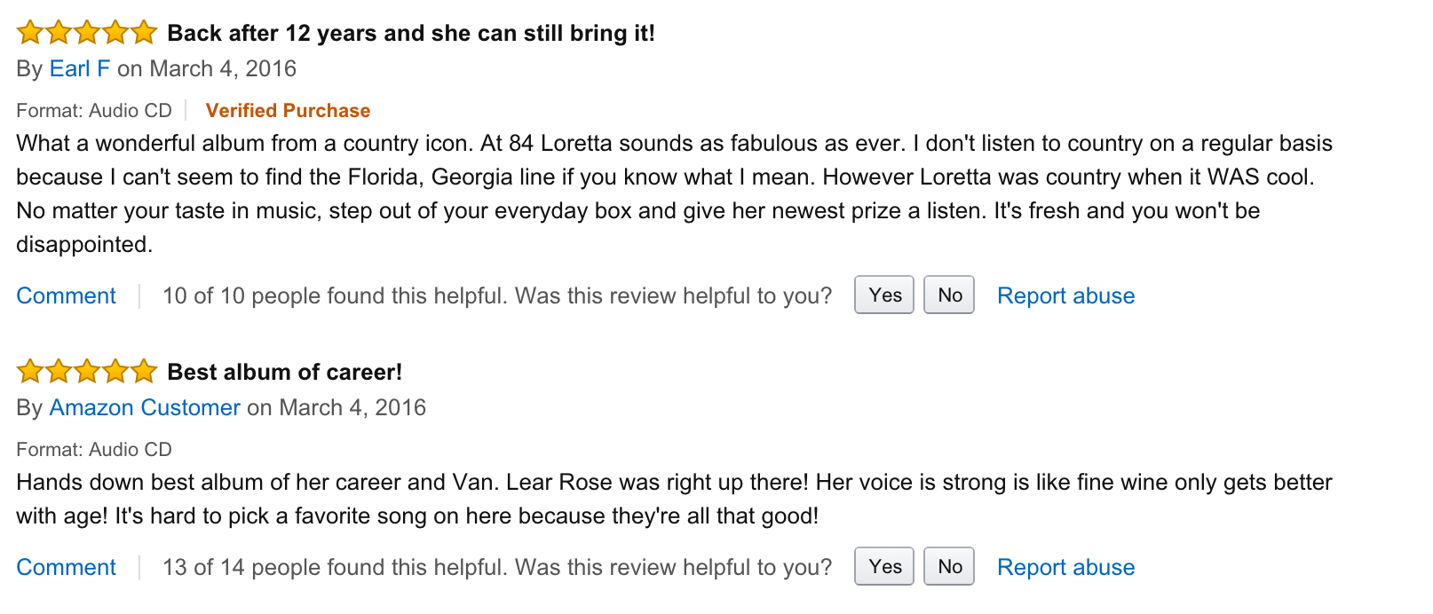
So, insert customer reviews underneath the product description. Amazon is well-known for following this model.
4. Content Hub
What exactly is a content hub?
Well, it’s a centralized location on your site to host branded content, curated content, and user-generated content. It’s a great method to show how your customers use your products, while tying your brand into the mix.

Jeff Zelaya (@JeffZelaya), sales team member at Triblio, offers six benefits of a content hub:
- Centralization: Host all your blog posts, social media, and videos at a single destination to provide a valuable experience to your website visitors.
- Control: Influence the visitor experience based on your marketing goals and objectives.
- Context: Highlight your brand’s content around a particular product, while including endorsements.
- Conversions: Feature optimized progressive profiling, pop-ups, and gated CTAs.
- Curation: Strengthen your brand’s voice by adding third-party commentary to your branded content.
- Content Amplification: Amplify your content by making it easy to share via social media channels.
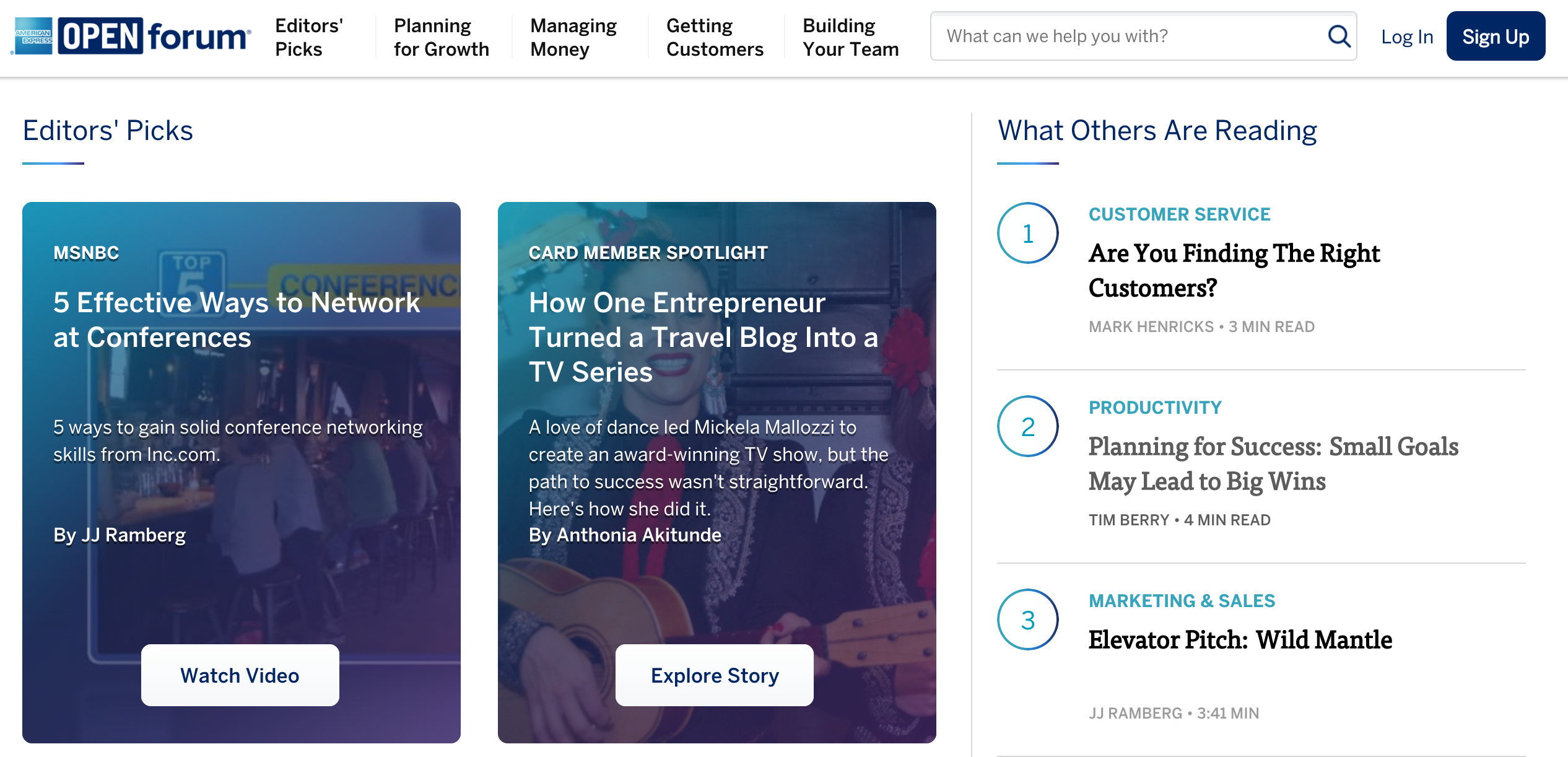
American Express hosts the OPEN Forum. This content hub offers businesses and entrepreneurs up-to-date content around growth and strategy. Plus, members receive exclusive access to additional resources.
Mobile Devices
Research uncovered that “62% of companies that designed a website specifically for mobile had increased sales.”
Alex Birkett (@iamalexbirkett), Growth Marketer at ConversionXL, writes, “Improving conversions on mobile is no easy feat, but it is a large opportunity area. Some of the problems are inherent to mobile, but some problems are fixable with a good process.”
Use the following tactics to guide your mobile journey.
1. Keep the Navigation Simple
On desktop screens, site menus are usually displayed on the top of the page. However, that’s not your best option for mobile devices. It will take up too much space.
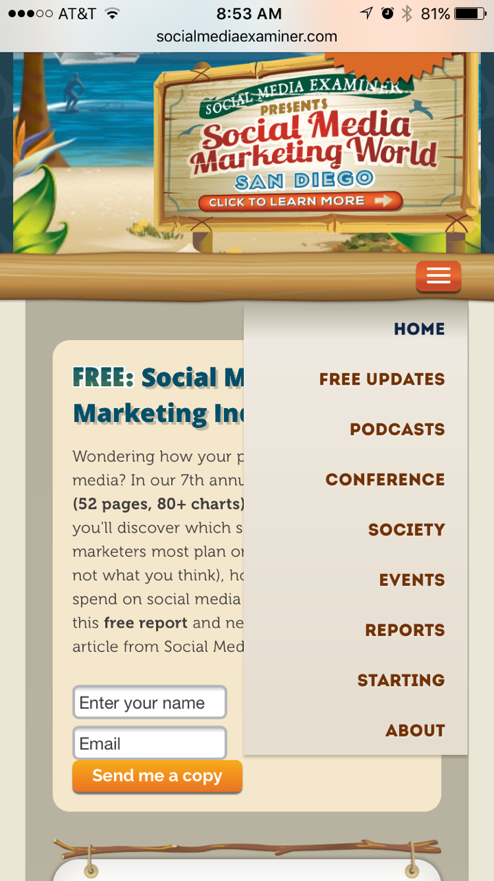
Instead, “make the menu a drop down accordion or icon on the top left or right of the mobile screen.” The key is to make everything easily accessible. So, avoid multi-level menus with four levels of submenus. It will only annoy the user.
Josh Long (@joshlong), Founder of Simplecast, says:
“The bottom line is that if a person doesn’t find that your mobile design makes your site or app useful, you’ve lost. Know the big idea behind your mobile design, know the problem you need to solve, and make your designs useful. Remember, if they’re useful, they’ll get used.”
Take a few hints from Social Media Examiner. They understand how to use drop down menus on mobile.
2. Create Short Headlines
Long headlines require website visitors to scroll more than necessary. Plus, it can decrease the number of clickthroughs. And you don’t want that.
Write short, catchy headlines that will grab the reader’s attention.
Aim for less than 75 characters. Include your keywords at the beginning and the end of your headline.
Freelance copywriter Pete Boyle (@P_J_Boyle), says:
“Brevity isn’t the act of cutting content. If you’ve got 10 primary selling points to put across, cutting it down to five is only going to harm your message. What you need to do is tighten the writing to get those 10 points across in as few words as possible. Cut everything that doesn’t add to the value of your page.”
A rule of thumb: Create headlines that people can skim quickly.
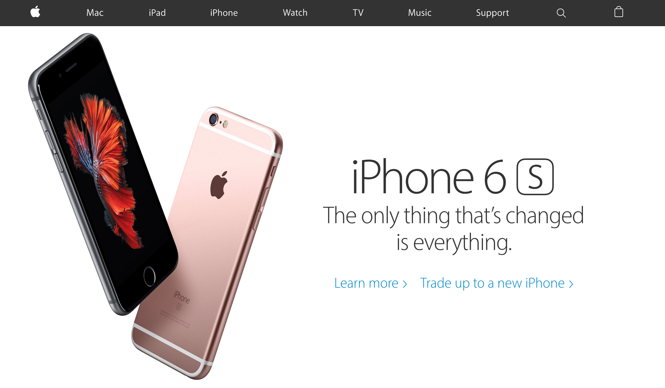
Check out this example from Apple.
3. Decrease Page Load Times
Mobile users are on-the-go. People want information right now. They don’t want to waste time waiting for a page to load.
So, what do mobile customers do when a site doesn’t load fast enough? Yes, you guessed it. They leave.
Source
Research tells us that “58 percent of mobile phone users expect websites to load as quickly, or faster, on their mobile devices as they load on their desktop computers.”
To retain people’s attention, make sure your mobile site loads in less than 5 seconds. Get rid of heavy graphics and load the minimum set of JavaScript and CSS files.
4. Declutter the Checkout Process
Design an improved mobile checkout experience. It will save your customers time and actually earn you more sales.
Optimize forms to reduce data entry. Use large text fields with clear calls-to-action.
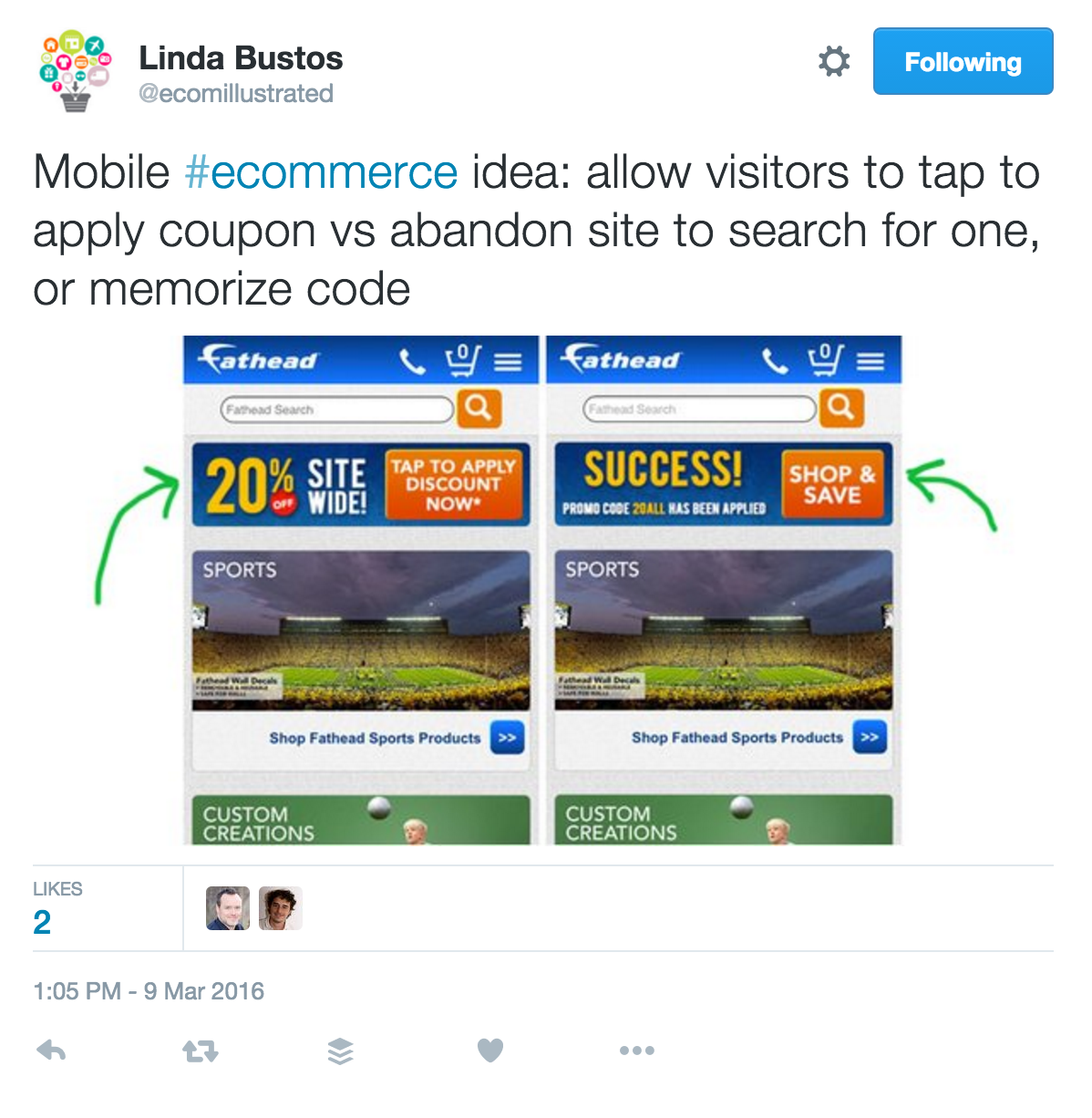
Linda Bustos (@edgacentlinda), Co-Founder and Managing Partner of Edgacent, tweeted an example from Fathead, a vinyl wall graphics manufacturer. It’s better to give customers a coupon, rather than have them abandon the shopping cart.
 Remove all the unnecessary fields in checkout. Offer an auto-fill option.
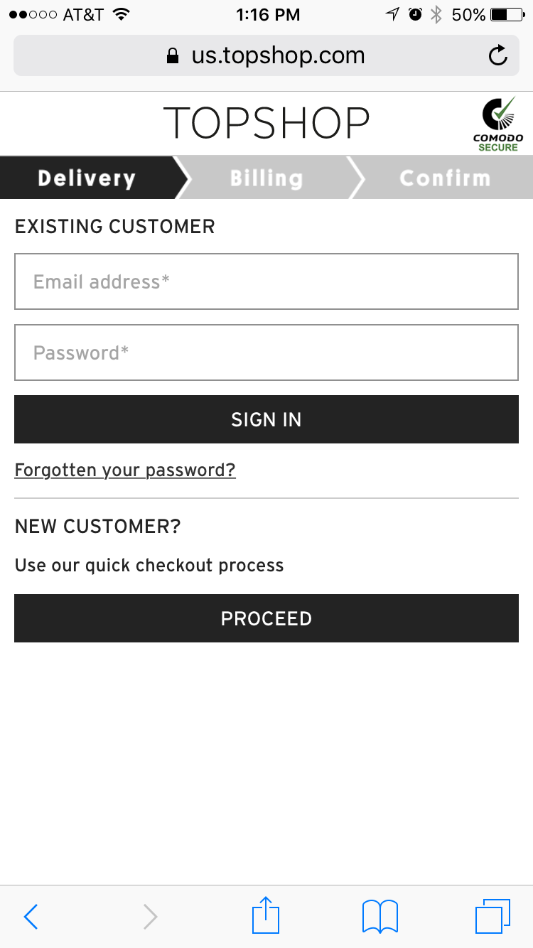
Topshop offers buyers a simple checkout with a prominent progress bar. Moreover, the brand has a guest checkout option and a postcode lookup tool.
Transform the User Experience
Your website is more than just a page with words and colorful pictures. Think of it as a representation of your business. Use it as a tool to create the best user experience.
Write copy that informs as well as persuades. Use live chat to enhance the sales process. Add product reviews to establish social proof. And optimize your site for mobile devices.
Don’t build a website. Instead, create a 10X user experience.


















We just started out a website where we need more downloads. Interesting our internal study done on a test site only managed to get 2% conversion rate.
Later on we added reviews, testimonials, trust magnet etc and managed to get it upto 5.6%. Now, our goal is to get it to 10%. I have hired a guy who is good at conversation optimization.
Is 10% a good number for the free download ?
I would like to implement some of these tactics into my website.
Stunning article, Keep it up. Thank you very much for sharing
Excellent article ! I think improving your site’s experience is very important and doesn’t cost a fortune. I think all the strategies you mentioned are inexpensive, yet highly effective in boosting your sales.I believe adding visual images to your website has an undeniable impact on your success and should be used more frequently.
Marcus Miller// Manager, http://www.enterprisemonkey.com.au
Very good And thank you
Good Post! Improving website experience is so much significant, It can give you boost of traffic and the more chances to get best conversation rates.
I have many time about the heatmap but not using it on my site, we will try to use it learn user behavior.
cool tips, grabbing attention in the first paragraph is very powerful as we have seen on low quality blogs people leave it within few seconds.
When you improve user experience, it helps to reduce friction among your website and your target audience. To get more leads Vrinsoft has a team of digital marketing experts in Melbourne will help you to boost your business.
Get in touch visit: https://www.vrinsoft.com.au/
That’s great! We’re also from Melbourne 🙂
Maybe we should grab a cuppa and talk about a partnership? You help your clients get more visitors on their website, we help convert that traffic into leads! We even offer a white label solution if you want to brand our chat platform as your own! Email [email protected] and let’s talk about it